Case Study
Simplifying content management for admins
ROLE
UX, UI, Research
TOOLS
2 months
PLATFORM
Web
COMPANY
Thrive
CONTRIBUTION
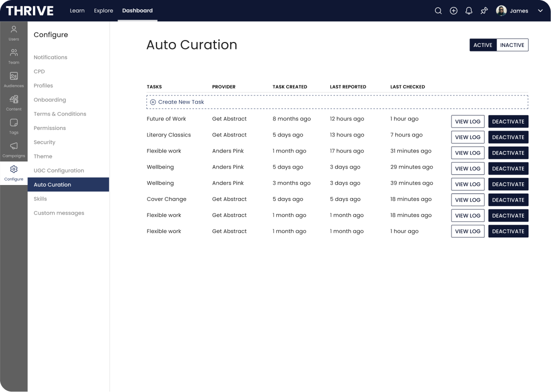
Led the redesign of Thrive’s Auto curation experience to give admins more control, improve content management and reduce reliance on support teams.


The problem
Thrive’s Auto Curation feature allowed integration from other content providers—such as LinkedIn Learning, Udemy, and Go1 into the Thrive platform. This was often utilised to help provide courses and learning materials to their workforces.
The original intent of auto curations was to easily manage and maintain content. As integrations expanded, platform admins struggled with managing the influx of content. It got to the point where support teams had to intervene to bulk remove unwanted content. Some customers even stated that they stopped using the feature altogether due to their frustrations.
Existing Overview Screen
Existing Step 1
Existing Step 2
Existing Step 3
Existing Step 4
Existing Step 5
Existing Step 6
How bad could it be?
Reviewing with the support team, the average amount of content being removed from customer domains averaged between 1500-2000 for larger content providers, with instances up to 5,000.
Customer Facing
Admin platforms were being flooded, making it harder to find the right things for their workforce.
Thrive Facing
2022 had 28 raised support tickets. Often last minute and causing support to reprioritise their tasks.
Who is this impacting?
Platform Admins
Admins curate and manage learning content, ensuring it aligns with their organisation’s needs.
Customer Success Managers (CSMs)
As the bridge between Thrive and its clients, they often introduced and onboarded users to the feature.
Support Teams
Point of call whenever bulk content deletion was requested.
Digging into painpoints
Leveraging the direct point of contact, I reached out to 4 CSMs, to dig a little deeper into the main issues users were having:
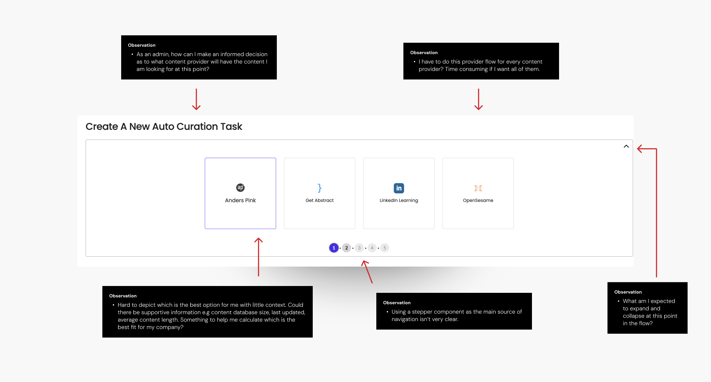
Unintuitive Workarounds
Users had to import content, then immediately deactivate it and then manually delete irrelevant content
You couldn’t preview what content was going to be pulled through. Admins would post, review the log after the fact and check if content was correct
Difficult Finding The Right Content
No way to narrow your search
Going through multiple curation flows was time consuming
Users didn’t know which provider had the content they were looking for
Job Behaviour Limitations
No option to delete jobs. Admins had to delete unwanted content one by one or raise support tickets
Can’t rename jobs
Can’t endorse content
How might we improve auto curations to reduce content overwhelm and alleviate support need?
This project aimed to:
Make it easier to pull in only content that was relevant
Provide more control over imported jobs
Reduce the need for support team assistance


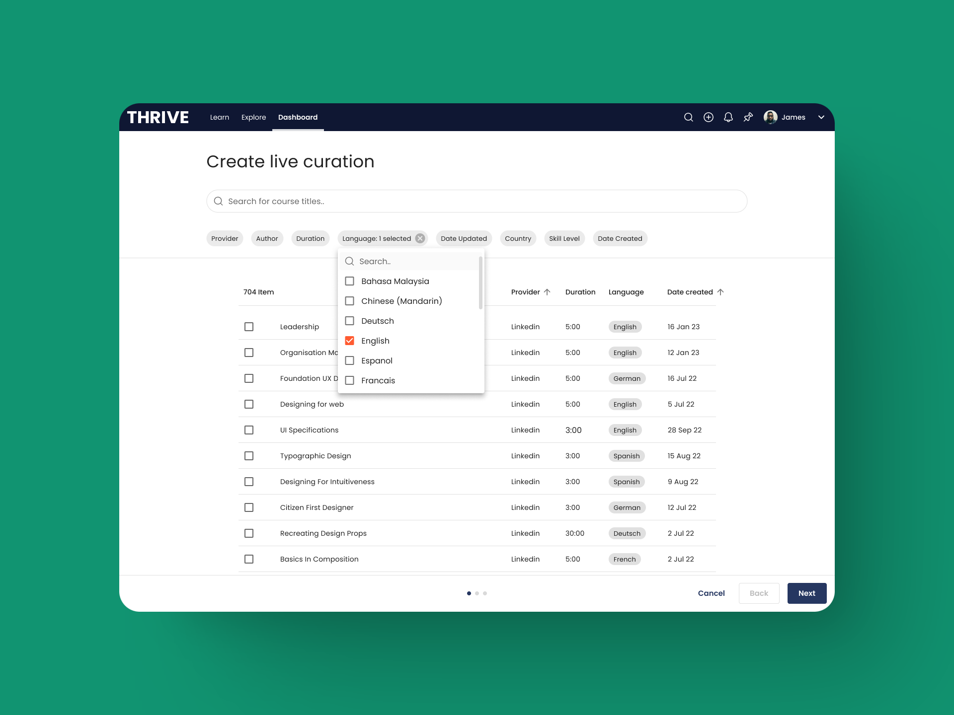
How might a merged experience look?
While chatting with the PM about the current auto-curation setup, we queried something that shifted our thinking: do admins actually care which provider their content comes from?
We know that before adding any content, admins had to manually enable the specific providers they wanted to use. At first glance, it seemed like admins cared about which providers they used — after all, they had to enable them manually. But in reality, we started to consider that the provider itself might not matter as much as being able to quickly find the right content, wherever it lives.
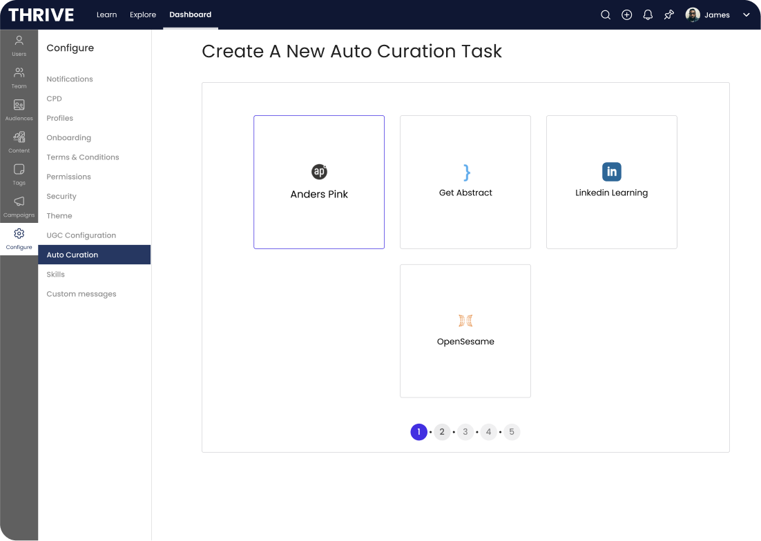
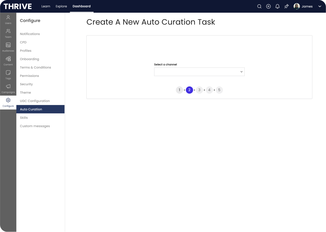
This insight led us to consider a new approach. Instead of separate flows for each provider, we introduce a merged catalog where admins could browse content from all enabled providers in one place.
This could give admins a wider view of available content and make the system easier to scale as more providers came on board.
Wireframe Exploration
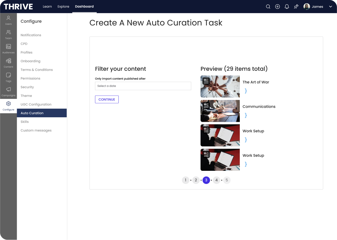
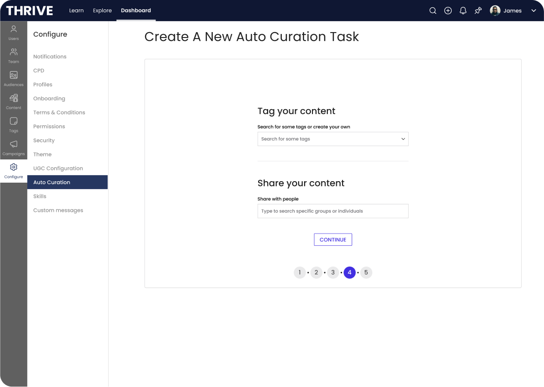
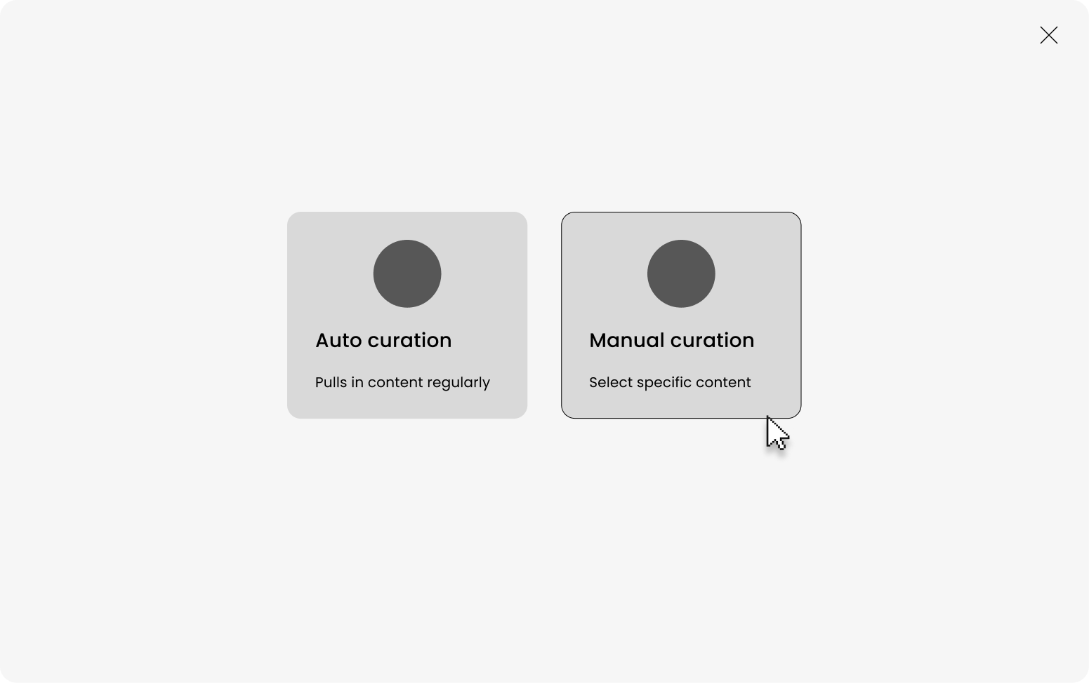
Since there was many edgecases where admins wanted specific content only, I explored where in the funnel could we choose between an auto curation (which pulled in content based on perameters) and a manual curation (allow users to only pull in specific content once).

A few technical considerations..
Before designing too deep, I needed to chat with tech and understand if this was feasible and air out any problematic spots I should design around.
💬 Loading all content from all providers might be performance intensive
Explore work around for initial loading of catalog
- Explore lazy loading of content
💬 We can’t remove visibility of content that already exists
- How do we let users know this that it won’t be pulled in?
💬 We can update tags/skills to existing content but we remove it
- Check with pm if this is an issue
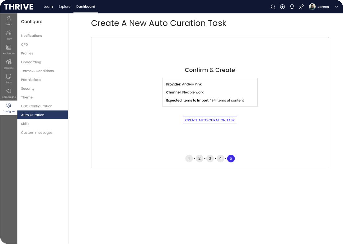
💬 Importing jobs may take up to a day to complete
- Consider how we notify users of this and when its ready
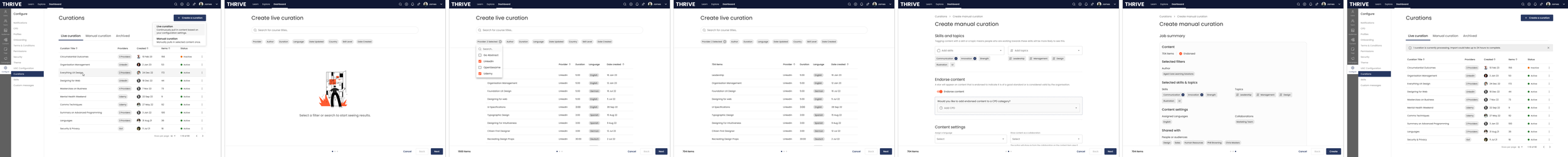

I began to work up high fidelity designs, fleshing out merged flow and also exploring the best way to showcase the two separate curation flows (manual and auto)
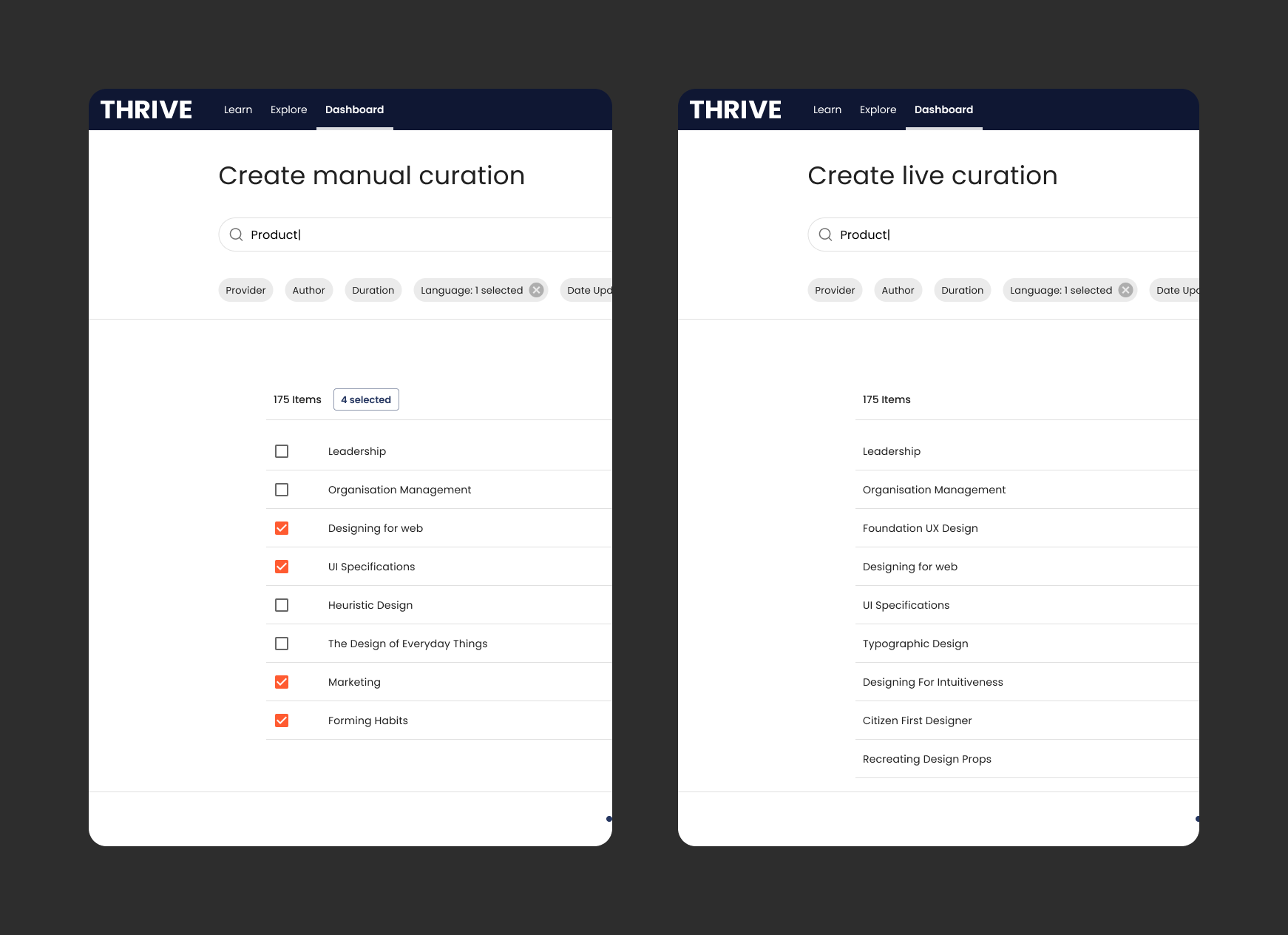
The separation between the two different curation modes was simple in nature. Manual would allow you to '‘check’ content you wanted specifically. Live would continuously pull in content that matched your search and filter perameters.
User Testing
I conducted a series of moderated sessions again with CSM’s and internal Thrive colleagues. I needed to gain some feedback regarding usability with introducing a merged provider flow. During these sessions, they were presented with prototypes for the following
Redesigned dashboard and curation entry points
Split flows for one-time job and continuous job flows (can you tell we couldn’t land on a solid naming convention for this?)
One flow for all providers and new filter functionality


4 of 4 users intuitively completed the task of filtering content by multiple criteria without issue.
4 of 4 easily grasped the distinction between manual and live curation, with both flows well understood.
4 of 4 found the flow intuitive and would benefit customers.
4 of 4 believe this was a big improvement to the existing functionality.
4 of 4 were able to edit an existing job and make changes.
2 of 4 users struggled to figure out how many items had been selected.
1 of 4 didn’t understand what ‘View log’ meant
Iterating based on findings


I shifted selected items to be a permanent place on the bottom navigation bar to make it clear how many items had been manually selected
“I kind of expected to be able to preview all my selected content”
From this insight, we opted to make it that you should be able to view your selection at any time during the flow. This was something that slipped through the cracks.
Outcomes
62%
of customers surveyed state that the feature “meets expectations” within 6 months of release
-80% support tickets
Content curation-related support tickets decreased by 80%, indicating improved usability